Power BI Visuals List: Which Graphic to choose?
Power BI Visuals List: Which Graphic to choose?

You can download the Power BI file on GitHub
Why this list?
Today, I had some time to learn!
I think I'm not that bad for data modeling, T-SQL, SQL server performance, Power Query, DAX, coaching and understanding user requirements. (Yes, sometimes it's very good to be kind to yourself :) )
But putting effort into many different techs skills, I should mention it to the whole world (at least you, because you are reading my blog post).
I’m not that good when it’s time to pick the best visual to show our data!
Table and Matrix fan
You will maybe recognize you in my description! I'm the kind of guy who uses Table and Matrix a lot. For testing and understanding my data!
Matrix is wonderful! You can look at the behavior of your measures at the different grain in one minute! List, Sub Total, Total!! Amazing!
I can't stop my crazy pleasure to click on all that kind of visuals

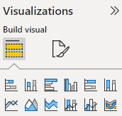
When I'm proud of it, I try to build a visual useful for my users. So I transform this table into a graphic. I click the first button, then I change for the second and I can't stop my crazy pleasure to click on all that kind of visuals!!
But do I know what I'm choosing? NO!
I knew, yes.. But right now, I'm just clicking to find the best one who will give me the satisfaction between 2 tasty coffees. (And yes, Power BI is also a question of feeling and pleasure. Like a very addictive game)
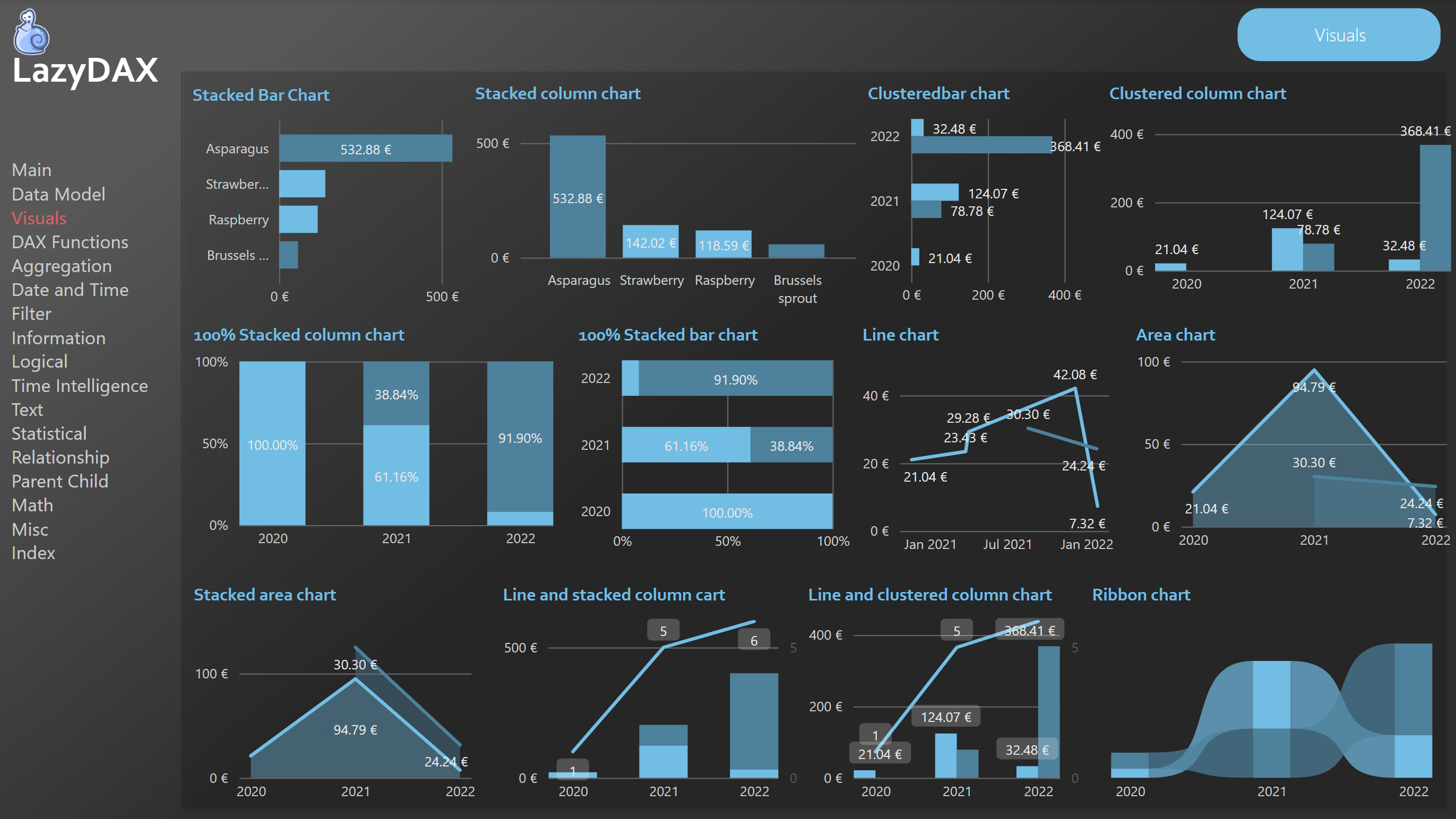
With the image on top, I tested all these graphics and keep a trace of them. First, to help me the next time I need to pick the right one. (And I hope, it can help you too)
More links
Visualization types in Power BI - Power BI | Microsoft Docs
Next step? I still need to learn more about visualization! And I will!
And you, do you click everywhere until you have the best one? If no, how did you become data artist / story teller?